Checklist

  • These are perfect for when you’d like a bulleted list, but also want something fancier.
  • You can change the icon in the circle, too, if you’d like it to be something specific
  • These are eye-catching and are great at breaking up larger blocks of text

Content Boxes

Gallery

Image Carousel

Text Block

This is a text block, just like a post! You can copy/paste from Word, or type content here.

Titles and Their Uses

H2 titles should be used first. If you’re separating a page out into different sections (like on this page) an H2 is what should be used.

If you need a subtitle under your H2, an H3 is what you should use. It’s smaller, but still larger than the normal text on the site.

Toggles

Toggles are great for FAQs – they allow users to only open the ones they’d like more information on. They also work well when you need to condense information to make it easier to digest.

Toggle Content

Toggle Content

Toggle Content

Toggle Content

Toggle Content

Toggle Content

Quick Links

Trash / Recycling

GIS Mapping

Emergency Alerts

Online Payments

Indiana Gateway

Video

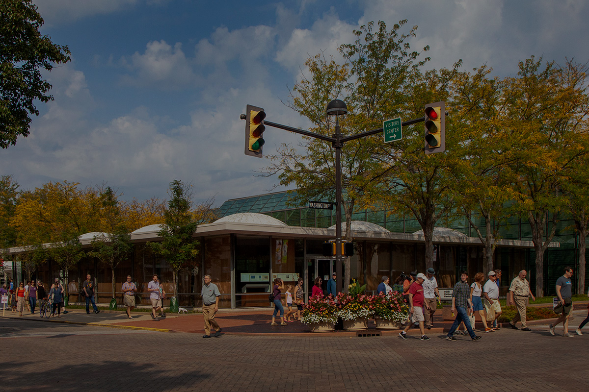
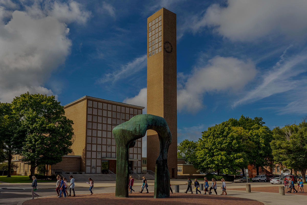
Midwestern Mecca of Architecture

Learn more about planning a visit to our unexpected, unforgettable community.

Two-Column Text & Image

Your text blurb goes here. This can be a paragraph or two, or maybe even just a few sentences.

Sometimes you might have a couple paragraphs about a program or service, but want to be able to give an introduction to it and then have users jump to another page. This is the perfect way to introduce that program.

We have this featured quite a bit on the CPD website, where we utilized “landing” pages to showcase different departments and divisions, and then have buttons to direct users to more detailed pages about each thing.


Using Color Behind Text

Sometimes, using a call-out box for important tidbits of information is a great way to make sure users are seeing what you want them to see. Maybe it’s an important phone number, or maybe you just want to break up a larger block of text with a blue background. Both are good reasons to use something like this! The background needs to stay blue, to fit with the City’s branding, and the text needs to stay white, so it can be readable.

You can also put a button in here!